At Marketing EQ, we spend a lot of time considering how to use color to support and enhance the messages (including the feel and emotional identity of a brand) that our clients want to communicate with their audiences. Every once in a while, we have a client who wants to use black backgrounds on all of their pieces in order to “stand out” – the thinking is that since everyone uses white as their primary background color, if they go the opposite way and use black instead, they will be extremely unique in the design landscape and stand out from their competition.
In some cases, this works out beautifully, but it’s not a decision that one should make lightly — the color black has major cultural baggage associated with it, and for brands that want to feel welcoming, family-friendly, homey or comfortable, this move can dramatically set them back.
Let’s take a look at some of the primary uses of black in branding and advertising:
Exclusive
Large quantities of black are often used in branding or advertising for companies that want their products to seem very exclusive. Why? Because in most situations, black is not welcoming or attention-grabbing.
For people who value status symbols that set them apart from the crowd, and are willing to go out of their way with both their time and their money to attain such items, a design that is not welcoming, and perhaps even a little difficult to figure out, is actually attractive.
This significantly narrows the market that you are selling to, because the entire point of using a black background is to deter large portions of the population, and by doing so, signaling to those who want to be part of exclusive clubs (even if that club is the “club” of people own the product) that if they purchase your product, they will be one of a very few who do so.
Often, a high price tag is associated with this type of product, because of scales of economy and as a further deterrent to the “average person,” so that ownership of the item can feel rare and special to those who do spend the money.
Because the market for people who buy based on exclusivity and have few price concerns is small compared to others, competition in this customer niche is also exceedingly high, and marketing can be very expensive.
Since most companies want to cast a wider net, this is one strong reason why you don’t see a lot of black-primary ads or brands.


Dangerous
In Western culture, black is the color of dark nights with no moon to light your way; of villains in cloaks who want to suck your blood, or waiting in vans to snatch your children; of masks used to conceal identities, especially for criminals; of stealth suits for sneaking up on people; of mourning and loss and funerals. For most, it is not a happy or comforting color.
Add a touch of red to your black, and you evoke deadly spiders, klaxons on sinking submarines, blood on the concrete. You arrive in the territory of horror movies in a hurry.
Of course, a little bit of danger can be alluring. There is a sort of person who seeks out controlled risks for the thrill of it, and there are those who wish to portray themselves as a little bit dangerous, “bad”, rebellious or otherwise outside of society and who understand that that may make others uncomfortable. If this is the audience you’re seeking, black might be your perfect match.
Nightlife and forbidden fruits
Let’s be real — it’s not just murders that happen in the dark. There’s a whole other kind of thing that goes bump in the night if you catch my drift…
Used correctly, black-primary design can evoke a sense of wild nightlife, of dancing in New York clubs, of youth culture, of sexiness, and of sex.
Speaking of — you have to be careful in this area, as there’s another kind of dance club where gentlemen might gather that predominantly uses black-primary branding.
Is that the message you want to send?
We’re asking without judgement. One or all of the above categories might be perfect for your brand — For example, if you’re in the business of escape room puzzles and you want to attract a customer that enjoys a mild feeling of peril, you’re probably on the right track with black-primary designs. If you sell staggeringly expensive accessories to an extremely elite clientele and have a marketing budget to match, black might be perfect for you.
However, if your company is meant to feel wholesome and welcoming, and you’re choosing black-primary designs in order to “stand out” because no one else is doing it, we hope you’ll consider that there might be an excellent reason why no one else is doing it! There are plenty of ways to stand out that don’t send such stark signals.

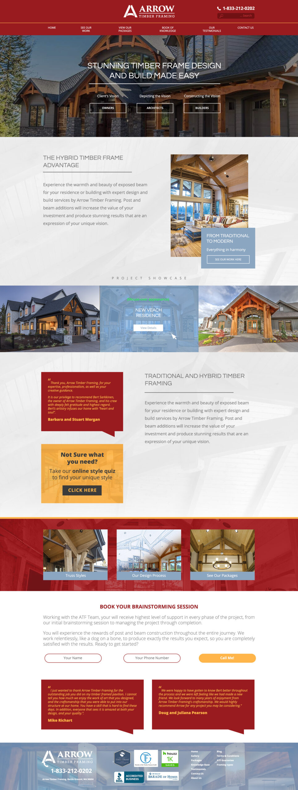
Arrow Timber Framing Website
Black background
Before website redevelopment
People who add timbers to their homes are considered ‘exclusive’ based on affordability. Timbers not usually a home necessity, it’s a luxury. Does this look like a luxury brand to you?

Arrow Timber Framing Website
Subtle background
Initial design after website redevelopment
Luxury requires a minimalist approach, where copy and images have room to breath and your eye can focus on key features. How does this new look feel to you? Does this convey luxury?

