Case Study: Arrow Timber Framing
Rebranding a complex and nuanced design, and a new and simplified website
Craftsmanship meets Luxury
Arrow Timber Frame’s Owner came to MEQ because he wanted an improved design for his website and a new brand look.
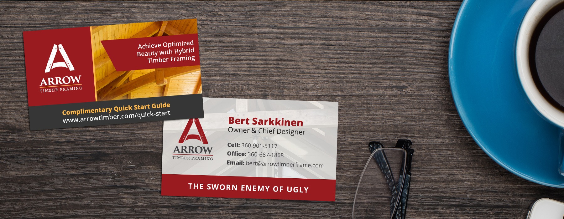
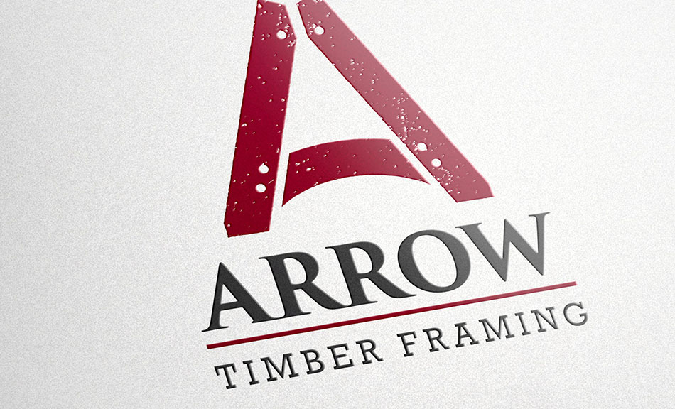
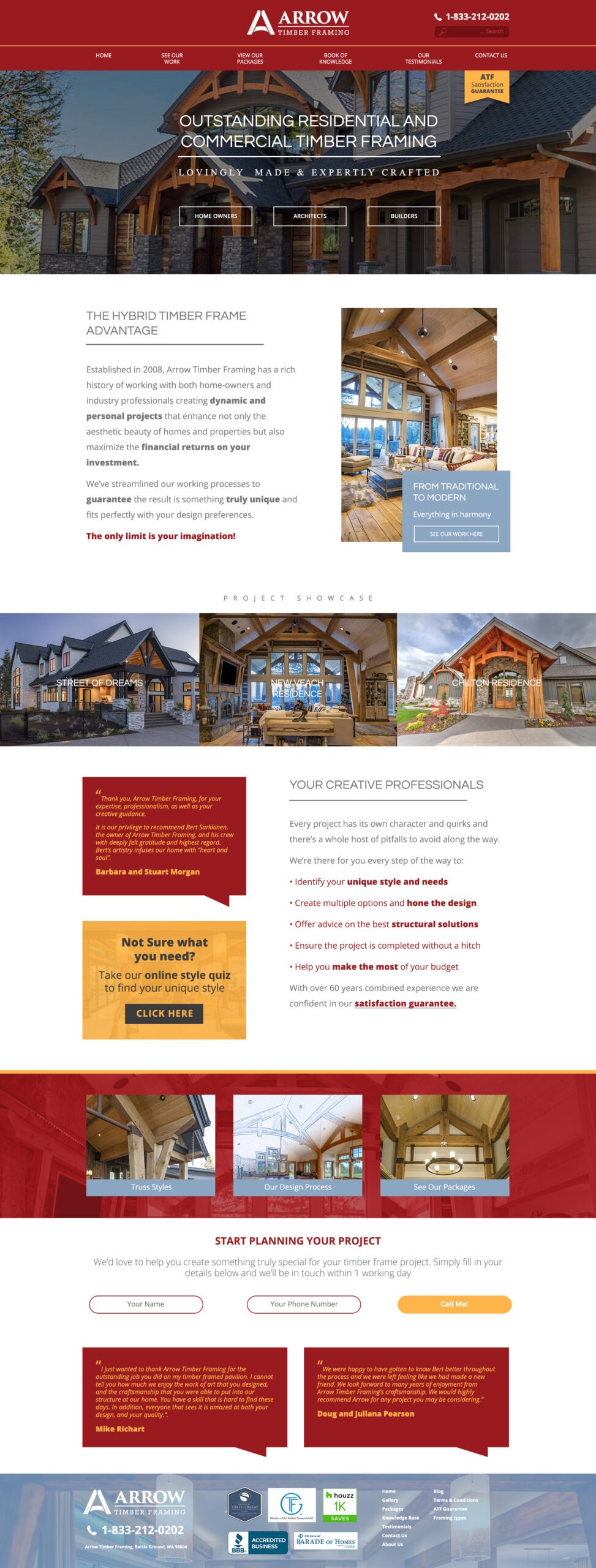
For the brand, the client wanted to maintain an old-world feel, but in a way that communicated luxury. Luxe is often black and white, and very minimalist, but with this design, it was important to present the organic aspect of the timbers. Also, the current website was heavy with black, dark red, and dark gold, so it was time to lighten things up a bit and give the site a lighter, more professional feel. The client wanted to keep the red and gold, but we modified them a bit and introduced a gray-blue and dark brown that is easier on the eye. Those complimented the red and gold very well. Once the logo and branding guidelines were established, we started to work on the design for the website.
The Challenge of defining a user experience
This website was very complex and contained volumes of content and images but with no defined content flow or user experience. This was hard for the user to find what they were looking for:
- Data nor pages were linked together
- The client didn’t know how the customers were using his site.
- An audience analysis was conducted to identify and understand the various audiences.
- Client interviews were conducted to establish the unique needs of each customer.
- A new copy strategy was developed for individual audiences.
- MEQ created a content, process and page flow for each of the three audiences.
- MEQ identified the top pages that clients cycled through over and over. Those were connected together and re-writted for ease of access.
As a result, site visitors could easily navigate the site, finding what they needed to move forward through the site without feeling overwhelmed or lost.
SEO Improvement – Site Traffic Exploded
With the new design and user experience, the user would never have to hit the back button again, so this improved the quality score of the site. In addition, we optimized the site to an A+ rating so it was light and respnsive. This too improved quality score. The search engines rewarded best site practices. We engaged in organic SEO too, and provided a tool for how to build page copy that ranks high with the search engines.
TRAFFIC RESULTS: In the first year of analysis, in 2019, annual site traffic was about 25,000 users. In the most recent report of site traffic, over six months, the traffic exceeded 106k. That’s roughly a 700% increase in website traffic as of 5.22.24.
Other Services
Arrow also relied on MEQ’s content and design expertise for their internal training manual, various design needs, and design and editing of the hardback tabletop book ‘The Art of Hybrid Timber Framing.’ They also engaged MEQ for Public Relations work which resulted in 9% customer growth.
Now, Arrow enjoys a stunning brand to match the big, bold and beautiful timbers they make. Check out the look of the original website found on our article about using black backgrounds in advertising.
Questions? Get in touch by phone, or fill out the form below. (360) 737-9888
We'd love to speak with you
The quickest way to ascertain how we can best help you is with a FREE consultation.
Click below to schedule a meeting at a time that suits you.
Prefer to send a message?
Strategy to design solutions
